
Advanced UI MCP Agent for any ML interaction
What you get
We believe that data is more than just numbers—it's a story waiting to be told. Our mission is to bridge the gap between raw data and meaningful insights, giving users the power to explore, analyze, and share their findings effortlessly.
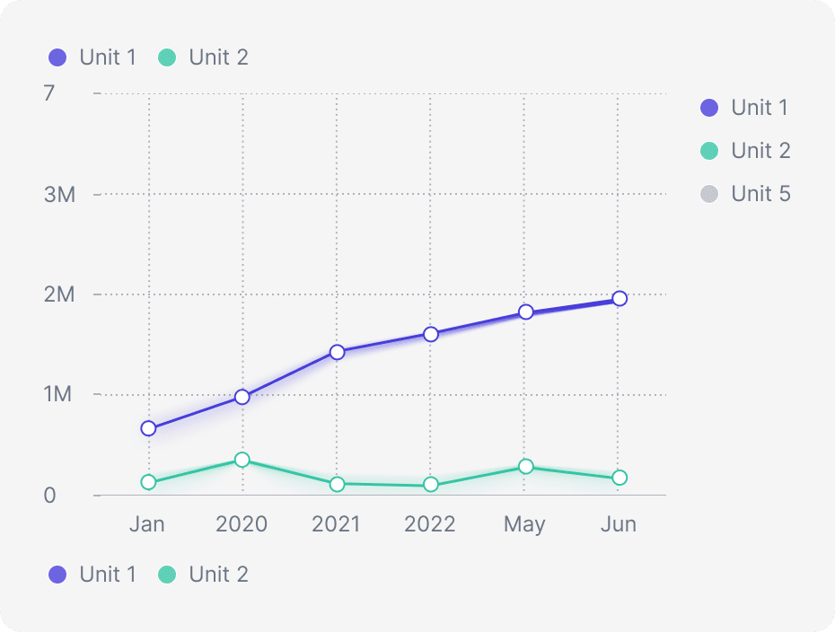
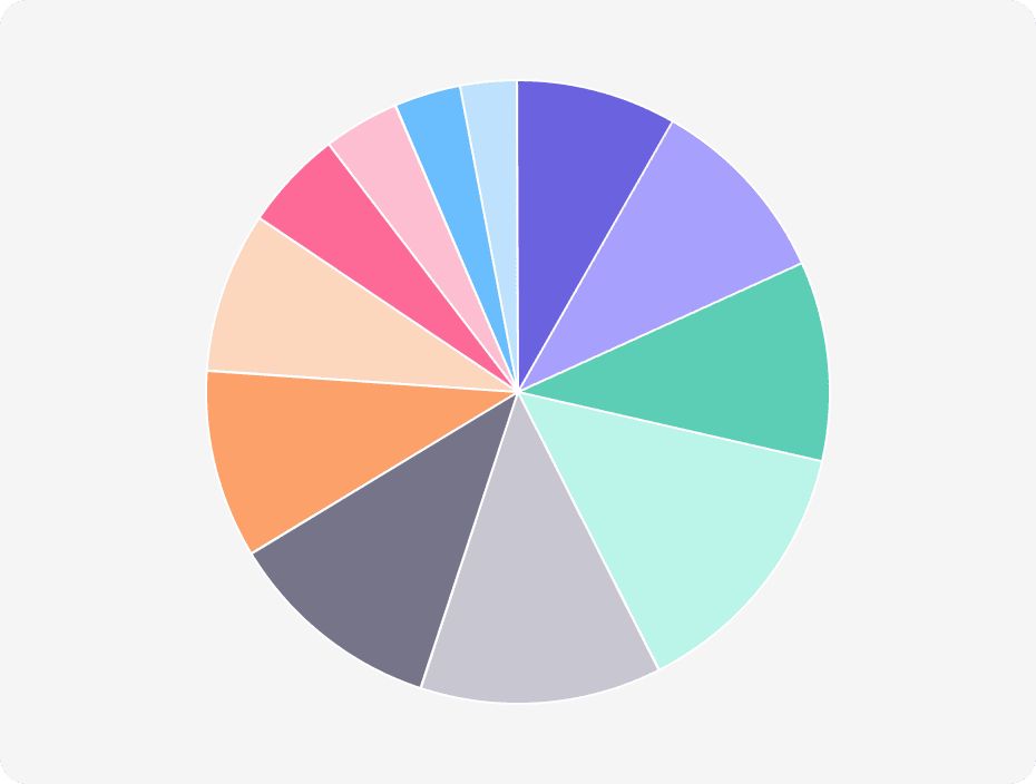
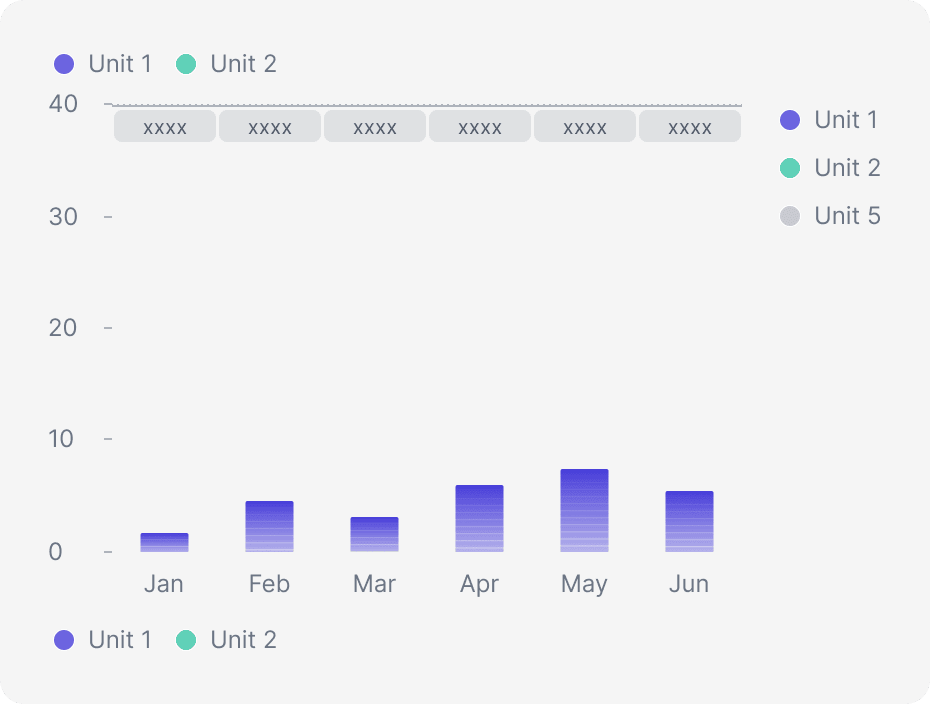
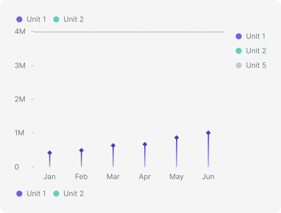
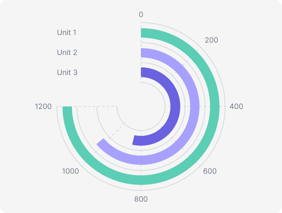
Charts
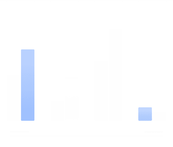
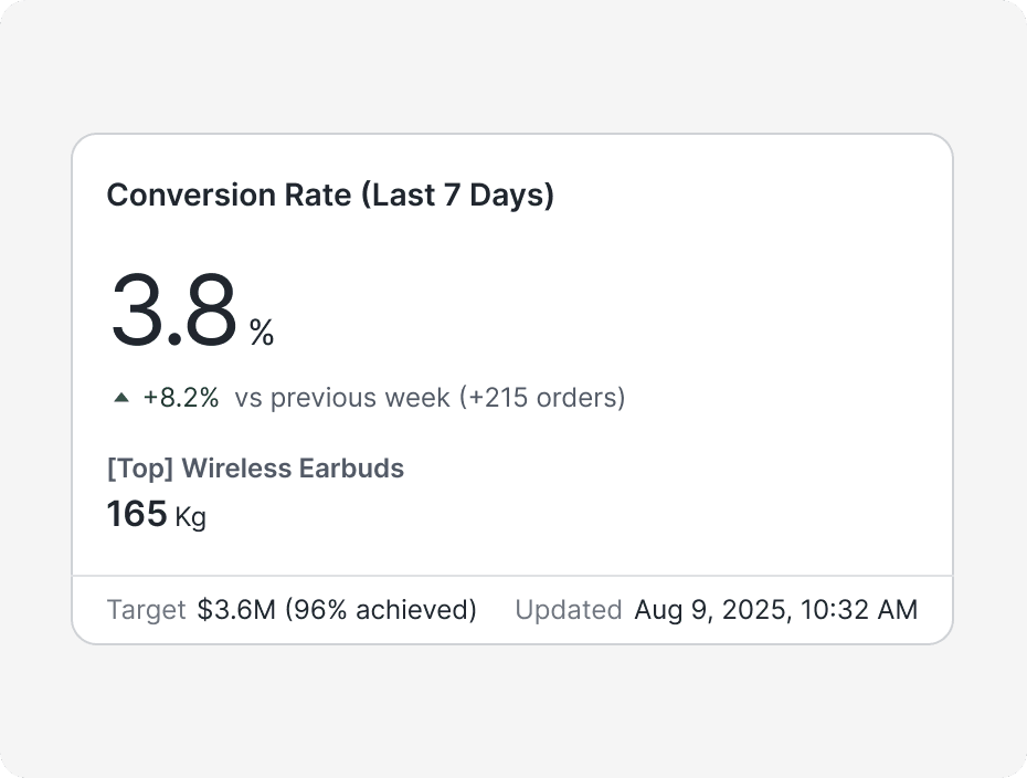
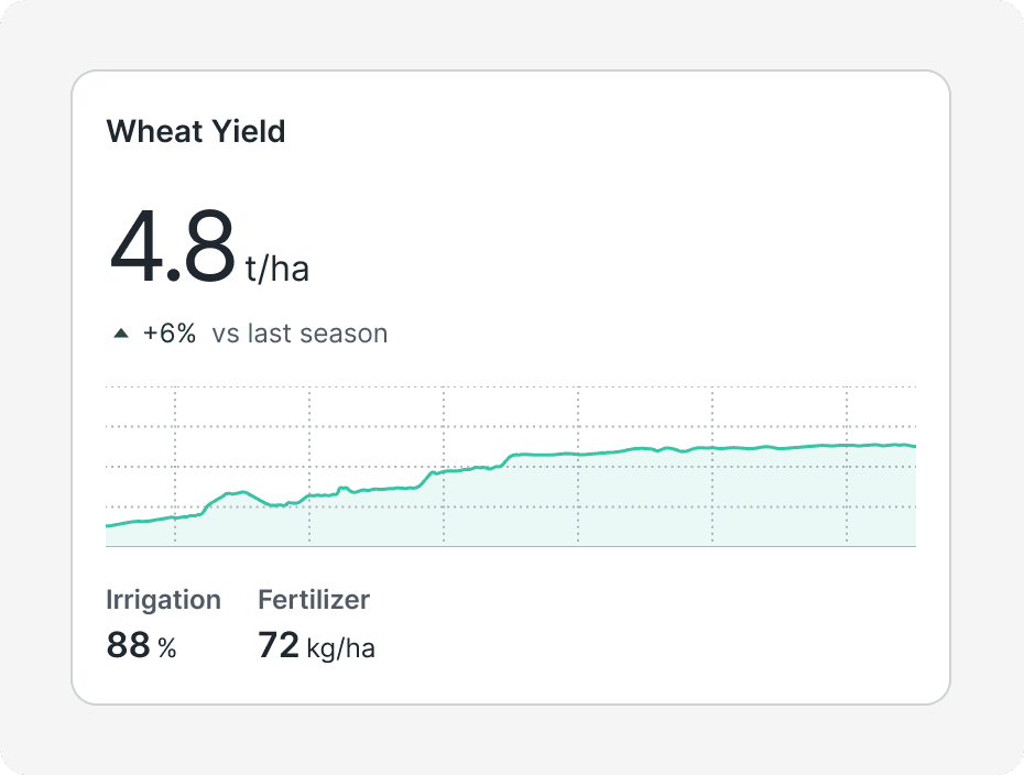
Kpi's
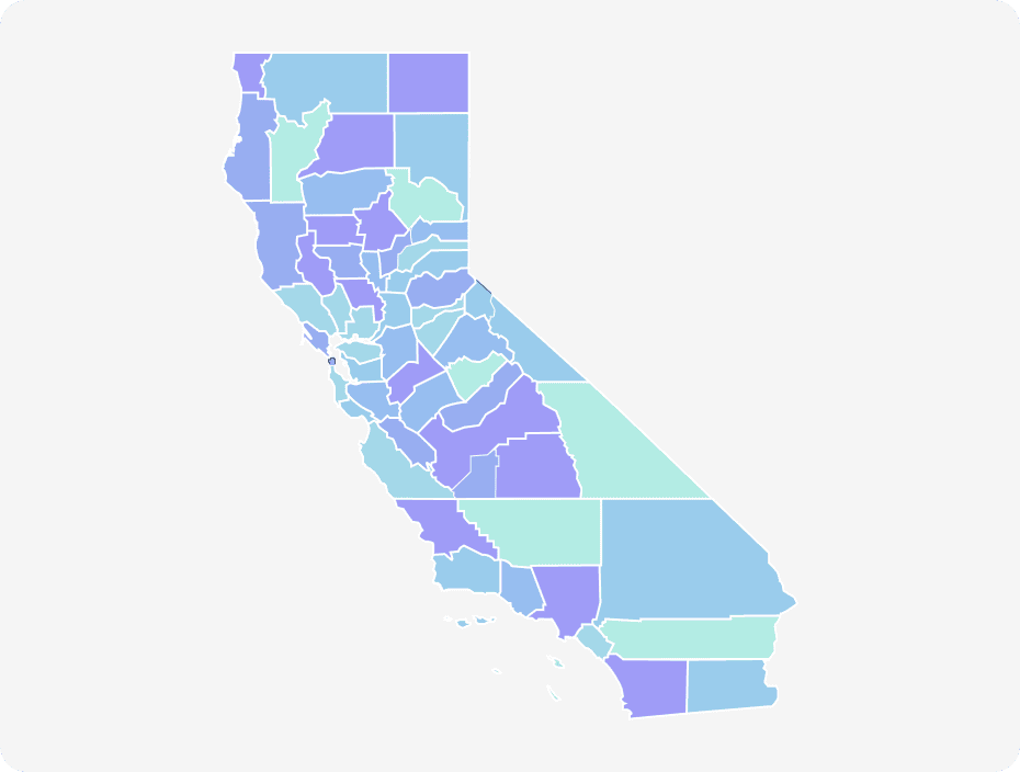
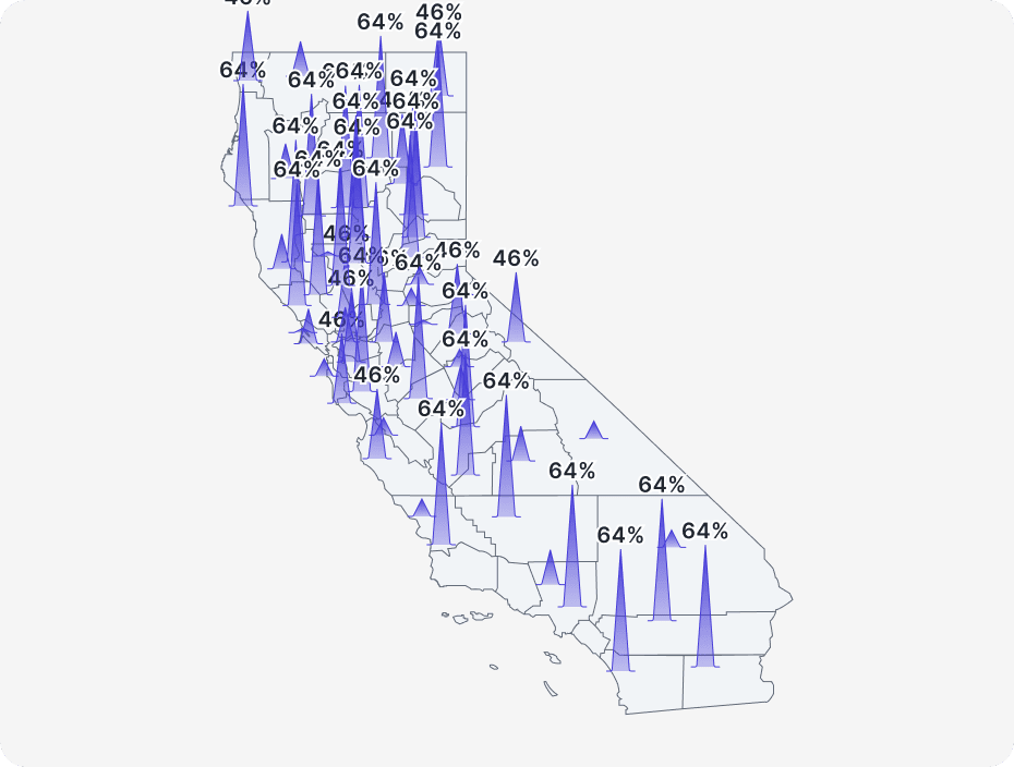
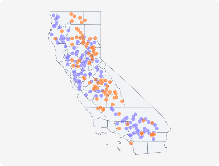
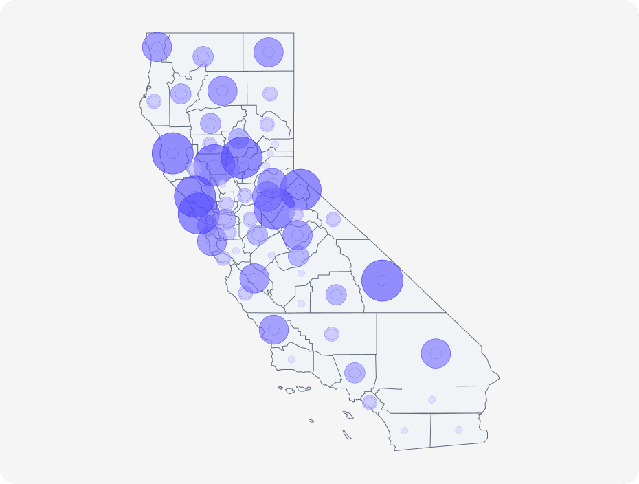
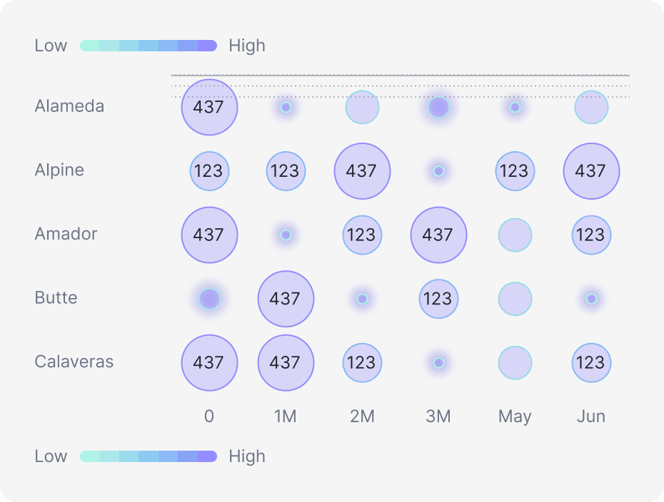
Map Visuals

Custom interaction
Our library
We believe that data is more than just numbers—it's a story waiting to be told. Our mission is to bridge the gap between raw data and meaningful insights, giving users the power to explore, analyze, and share their findings effortlessly.
Coming soon
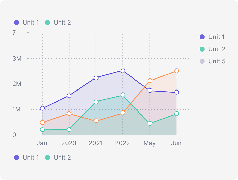
Line Chart
Coming soon
Area Chart
Coming soon
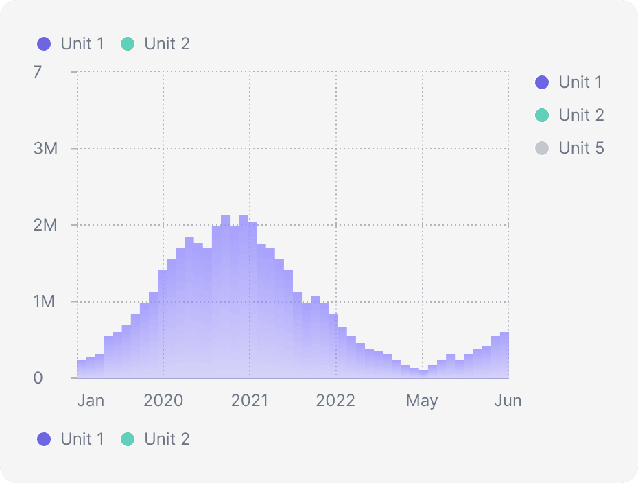
Histogram Chart
Coming soon
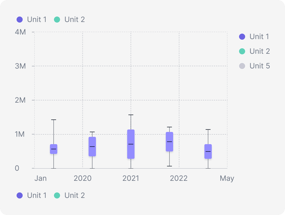
Boxplot Chart
Coming soon
Heatmap Chart
Coming soon
Spikes Chart
Coming soon
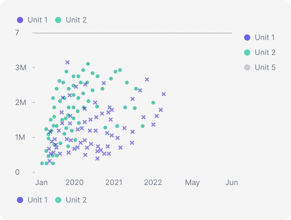
Scatterplot Chart
Coming soon
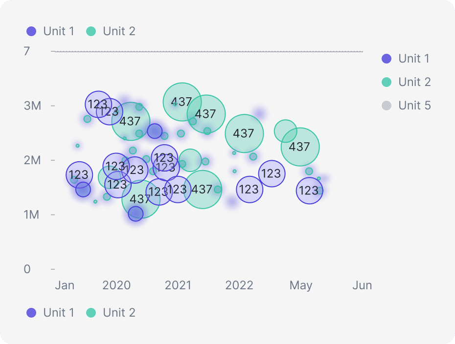
Bubbles Chart
Coming soon
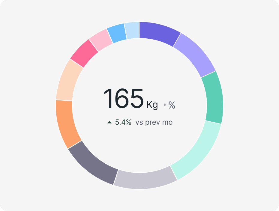
Pie Chart
Coming soon
Donut Chart
Coming soon
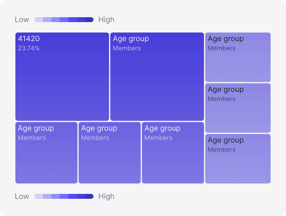
Treemap Chart
Coming soon
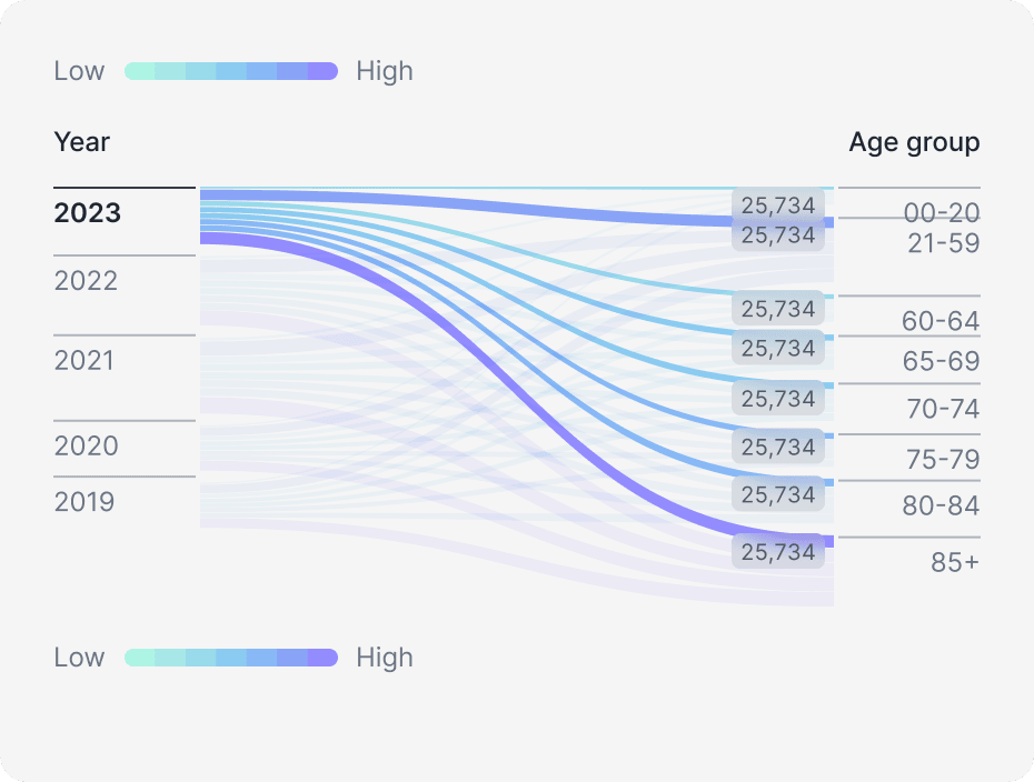
Sankey Chart
Coming soon
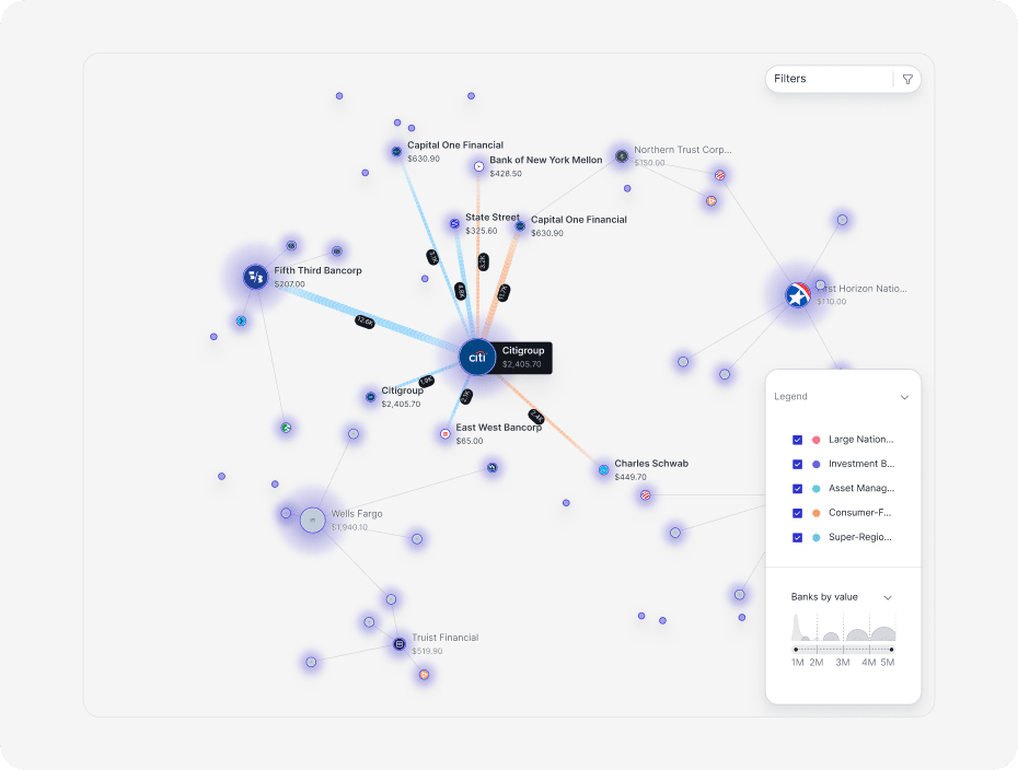
Network Chart
Coming soon
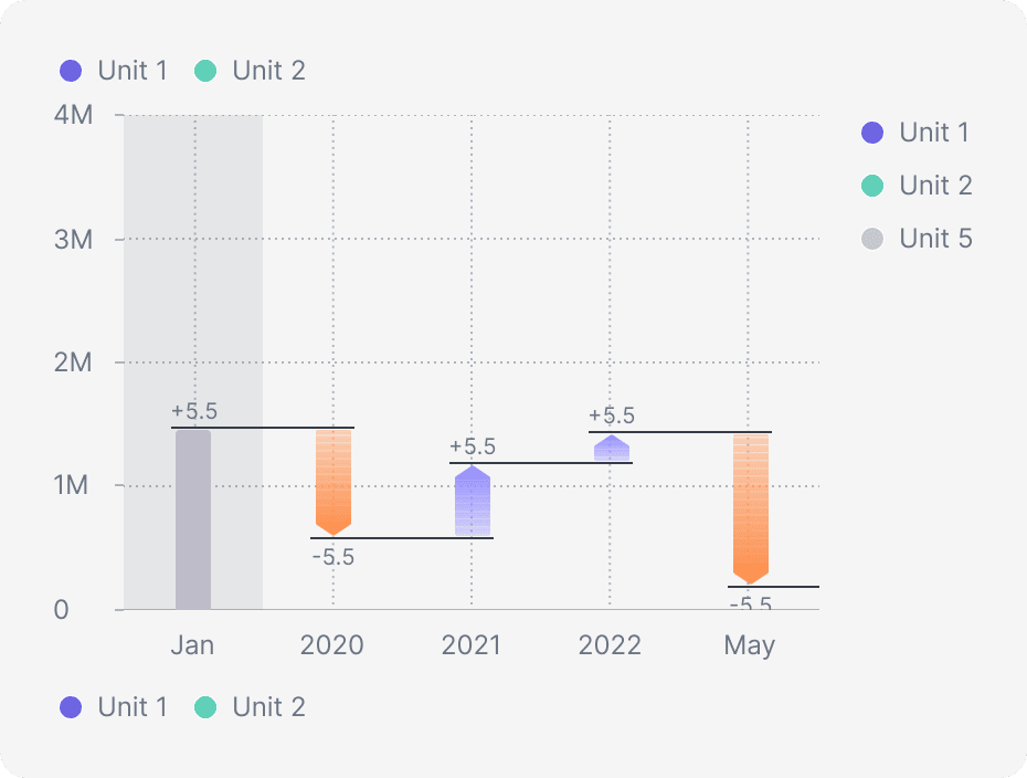
Waterfall Chart
Coming soon
Scatterplot Chart
Coming soon
Bubble Chart
Coming soon
Matrix Chart
Coming soon
Punchcard Chart
Coming soon
Bar Chart
Coming soon
Lollipop Chart
Coming soon
Radial Bar Chart
Coming soon
Polar Chart
Coming soon
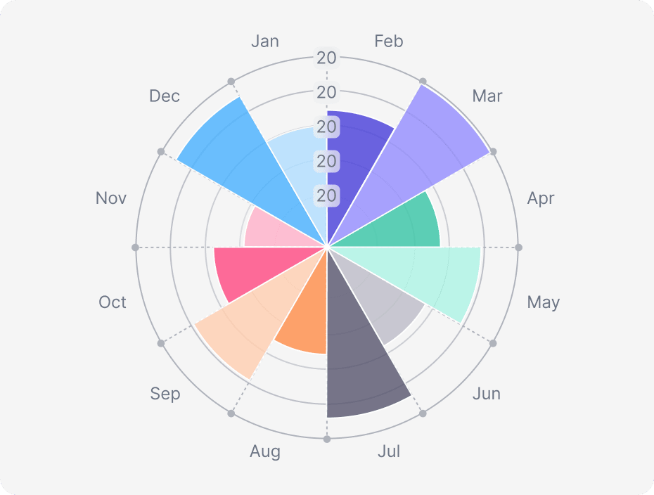
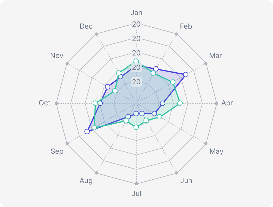
Radar Chart
Coming soon
Retail and E-commerce
Coming soon
Agriculture
Coming soon
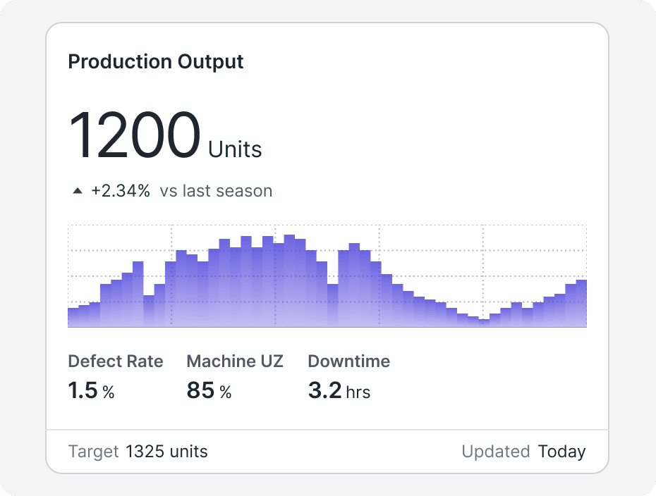
Manufacturing
Coming soon
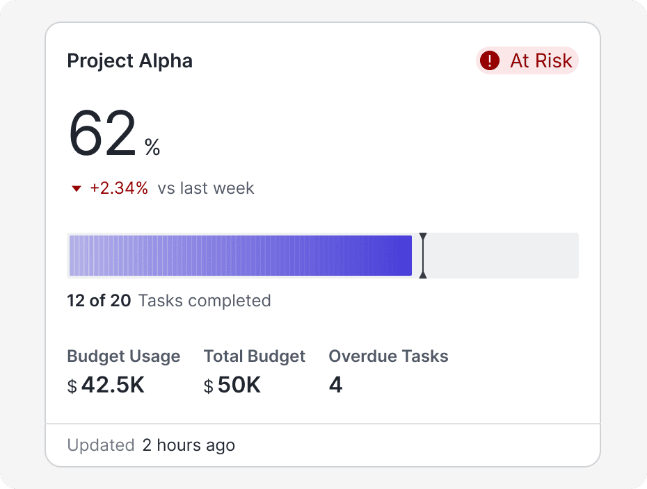
Project Management
Coming soon
Line Chart
Coming soon
Area Chart
Coming soon
Histogram Chart
Coming soon
Boxplot Chart
Coming soon
Heatmap Chart
Coming soon
Spikes Chart
Coming soon
Scatterplot Chart
Coming soon
Bubbles Chart
Coming soon
Pie Chart
Coming soon
Donut Chart
Coming soon
Treemap Chart
Coming soon
Sankey Chart
Coming soon
Network Chart
Coming soon
Waterfall Chart
Coming soon
Scatterplot Chart
Coming soon
Bubble Chart
Coming soon
Matrix Chart
Coming soon
Punchcard Chart
Coming soon
Bar Chart
Coming soon
Lollipop Chart
Coming soon
Radial Bar Chart
Coming soon
Polar Chart
Coming soon
Radar Chart
Coming soon
Retail and E-commerce
Coming soon
Agriculture
Coming soon
Manufacturing
Coming soon
Project Management
Coming soon
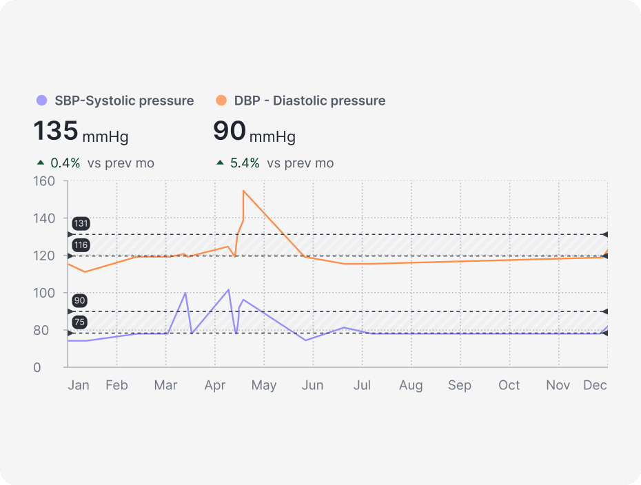
Blood Pressure
Coming soon
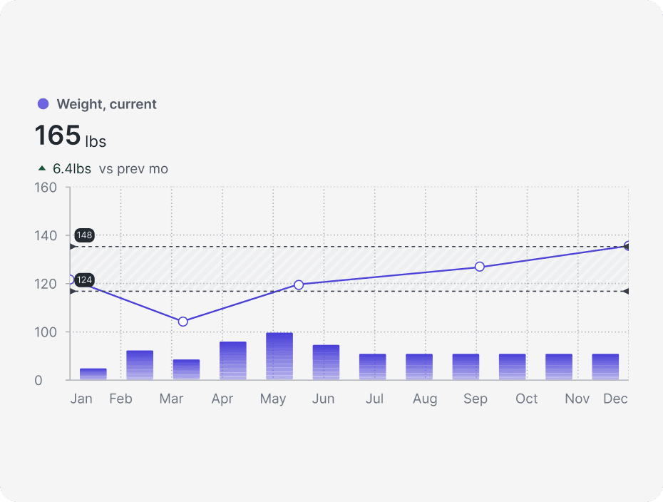
Weight
Coming soon
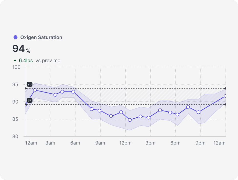
Oxigen saturation
Coming soon
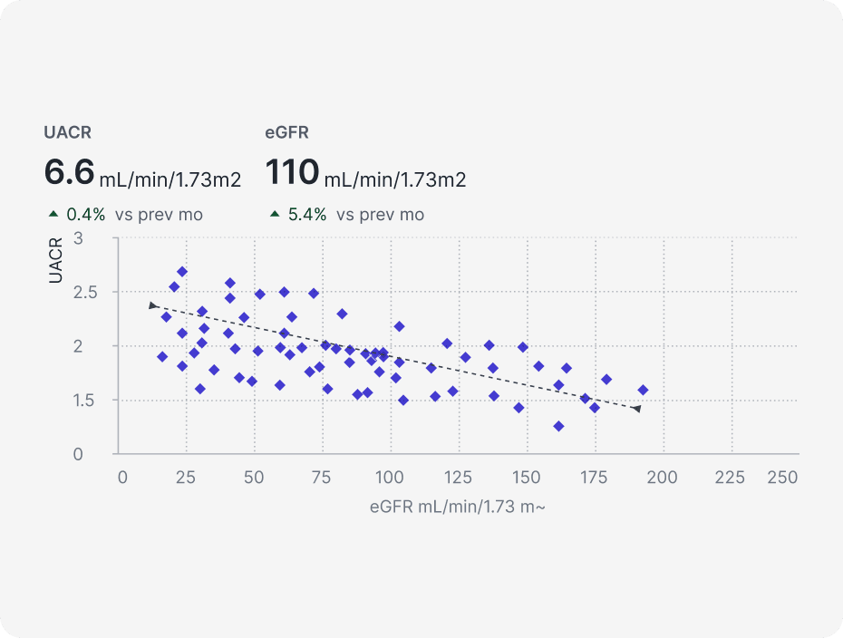
ACR
Coming soon
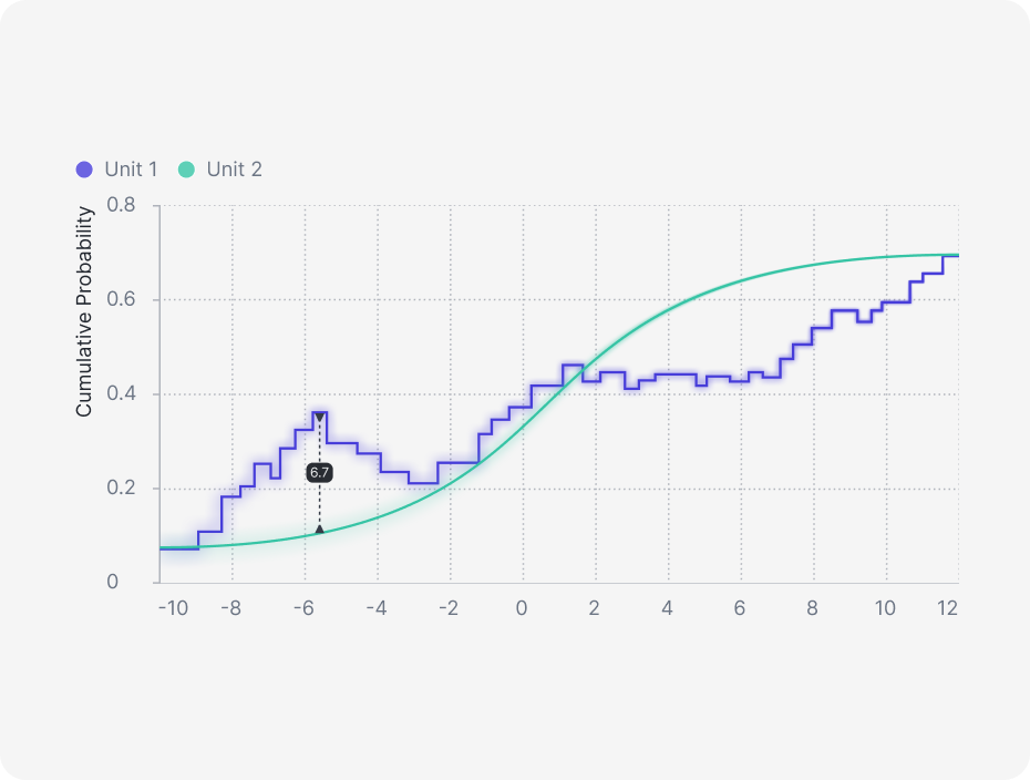
KS Plot
Coming soon
SHAP Plot
Coming soon
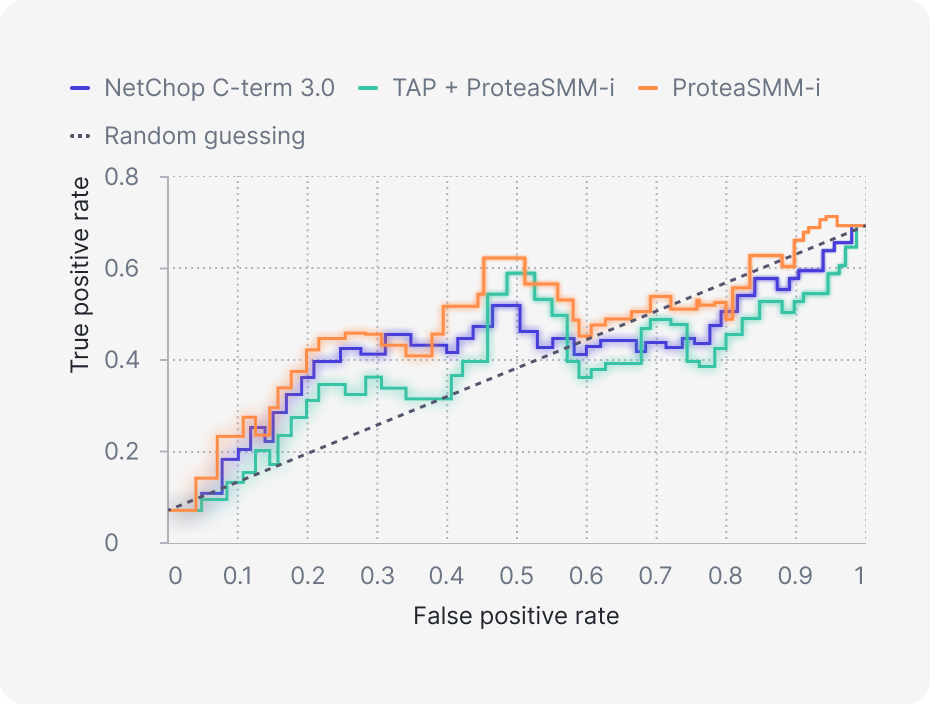
ROC Curve
Coming soon
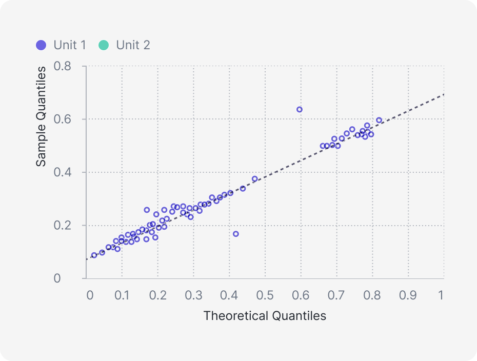
QQ plot
Coming soon
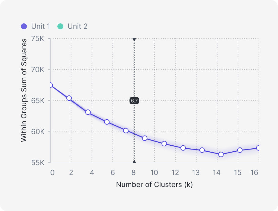
Elbow Curve Plot
Coming soon
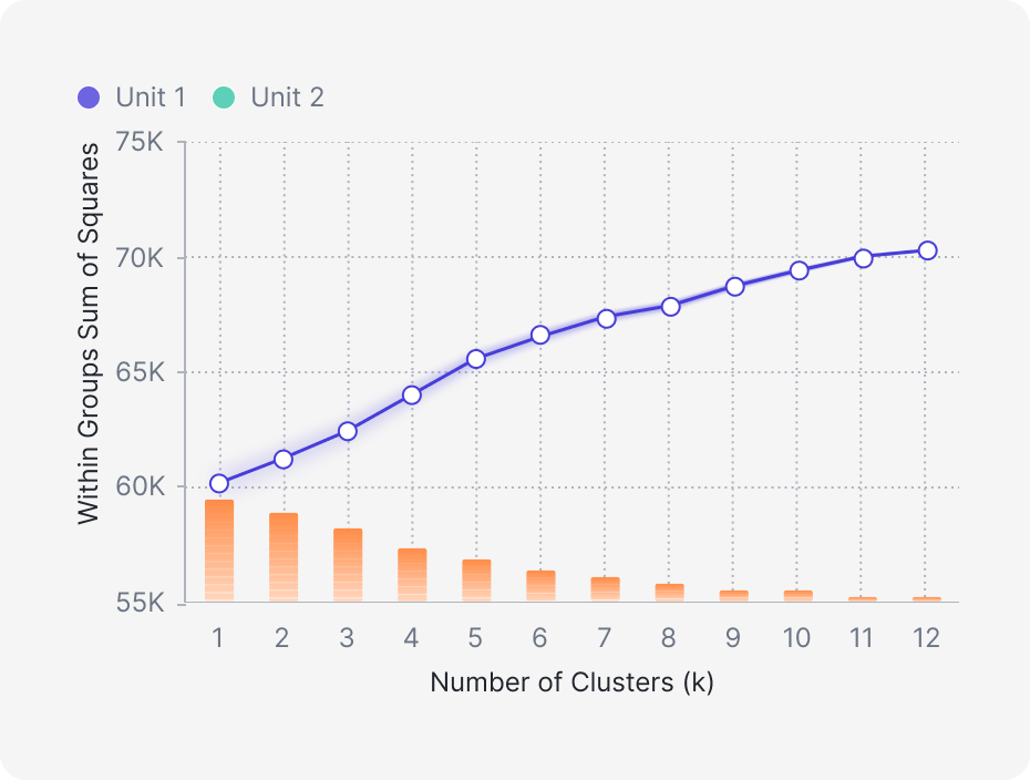
Cumulative Explained Variance
Coming soon
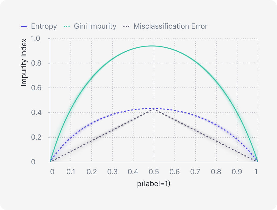
Gini Impurity and Entropy
Coming soon
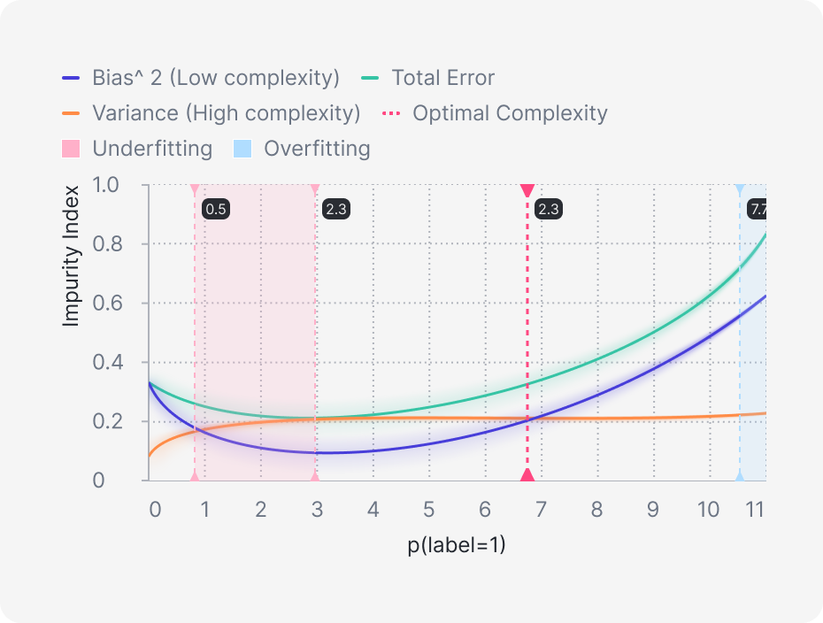
Bias-Variance Tradeoff
Coming soon
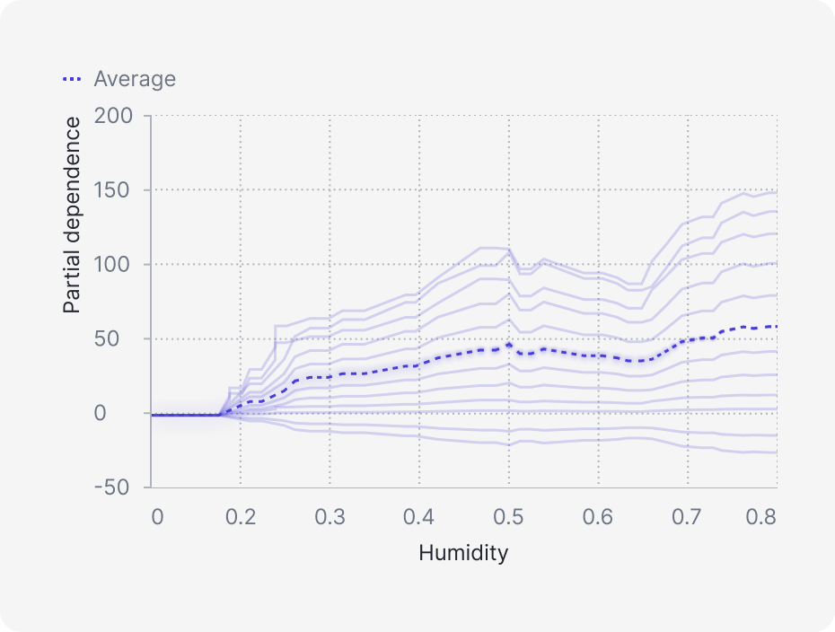
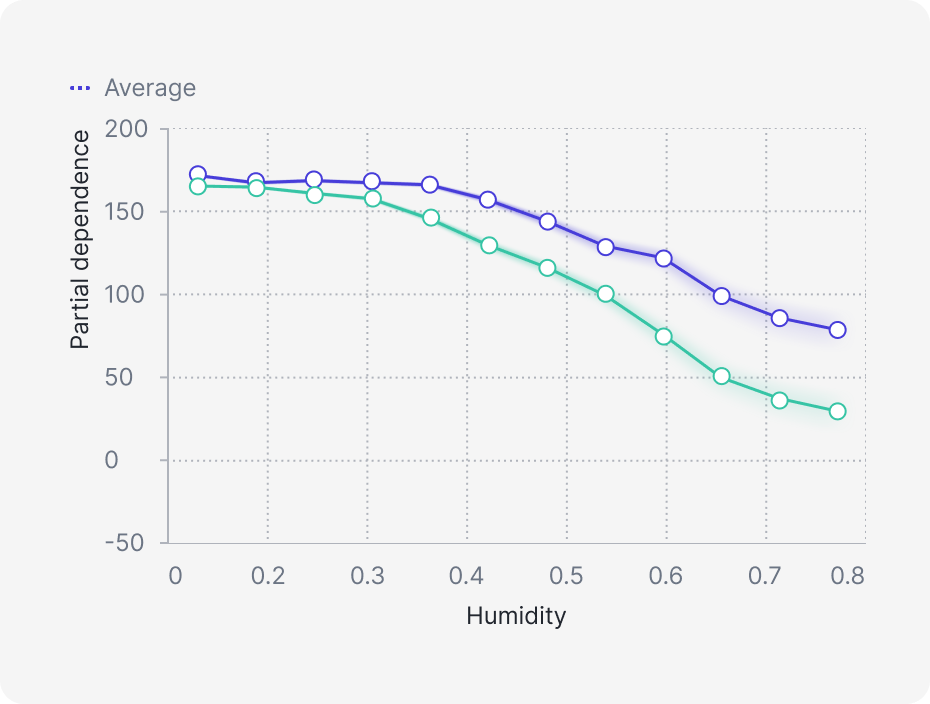
(PDP) with ICE lines.
Coming soon
Precision Recall Plot
Try it in our playground future?
Everything You Need to Know
Have questions about how our platform works? We’ve got answers. Learn about integrations, data security, and how we help trainers deliver exceptional results.
Heading
- Added context capability for agents endpoint
- Added context capability for agents endpoint
- Added context capability for agents endpoint
- Added context capability for agents endpoint
- Added context capability for agents endpoint
- Added context capability for agents endpoint
- Added context capability for agents endpoint
- Added context capability for agents endpoint
- Added context capability for agents endpoint
- Added context capability for agents endpoint
- Added context capability for agents endpoint
- Added context capability for agents endpoint
- Added context capability for agents endpoint
- Added context capability for agents endpoint
- Added context capability for agents endpoint
- Added context capability for agents endpoint